Author: coupler

The best free & paid Looker Studio templates, curated and quality-ranked for data reporting.

Clear All

Showing 1 - 8 of 8

CRM dashboard for HubSpot cover image
CRM dashboard for HubSpot

HubSpot CRM dashboard to monitor pipeline health, revenue trends, deal stages, sources, and rep performance.

HubSpot CRM sales dashboard template for Looker Studio focused on pipeline performance and revenue. Track closed amount, close rate, average days to close, open deals, pipeline value, projected revenue, and deal age over time. Visualize trends for won deals and revenue, compare pipelines by agents and deal types, and audit stage progression month over month. Analyze deal sources and an agent leaderboard to surface top performers and bottlenecks. Ideal for sales leaders and RevOps teams to improve forecasting and execution.
Free
Salesforce Win Loss analysis cover image
Salesforce Win Loss analysis

Salesforce win–loss analysis of amounts, deal counts, win rate, and segment performance over time.

Salesforce Win/Loss analysis focused on understanding which opportunities convert and which don’t. Tracks won and lost amount, number of opportunities, average deal size, and win/loss rates with monthly trends. Highlights performance by industry, owner, lead source, and country to expose strong segments and leakage points. Helps spot seasonality, monitor rep effectiveness, and target channels that bring higher‑value wins. Built for quick sales performance reviews and pipeline optimization.
Free
CRM dashboard for Salesforce cover image
CRM dashboard for Salesforce

Salesforce CRM template for tracking pipeline, revenue, win rates, deal stages, lead sources, and owner performance.

Salesforce CRM dashboard template focused on pipeline health, revenue trends, and sales performance. Tracks core KPIs including total sales, pipeline value, win rate, close rate, average days to close, open deals, expected revenue, and deal age. Highlights deal stage progression and revenue by lead source to spot bottlenecks and channel impact. Compares trends such as closed amount vs won opportunities and expected revenue vs opportunities due. Surfaces best and worst-performing owners to guide coaching and resource allocation.
Free
Google Calendar dashboard cover image
Google Calendar dashboard

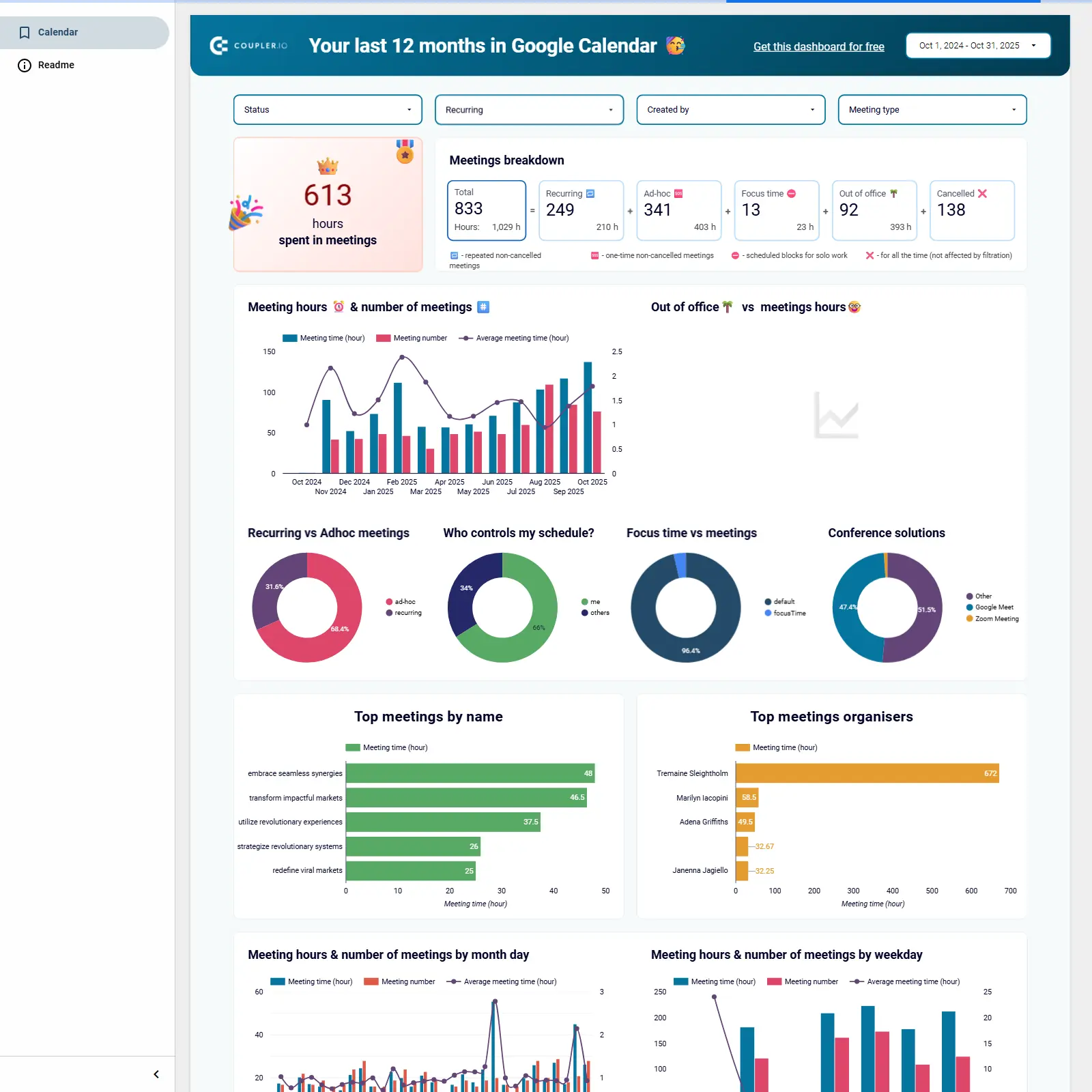
Google Calendar analytics in Looker Studio to audit meeting load, availability, focus time, and scheduling patterns.

Google Calendar analytics template for Looker Studio that converts your event history into clear, actionable time insights. Track total meeting hours, availability percentage, recurring vs ad‑hoc mix, focus time and out‑of‑office, top meeting organizers, conferencing tools, and trends by day, week, and month. Surface overload and cancelation patterns, pinpoint who drives most meetings, and spot peak vs low workload periods. Identify natural focus windows to rebalance time allocation, increase deep work, and prevent burnout. Automated refresh via Coupler.io keeps insights current for ongoing planning.
Free
CRM dashboard for Pipedrive cover image
CRM dashboard for Pipedrive

Pipedrive CRM template for monitoring pipeline health, conversion rates, revenue trends, and rep performance.

Pipedrive CRM template focused on revenue and pipeline performance across teams and deal labels. Tracks essentials like total sales, win rate, close rate, average days to close, pipeline value, open deals, weighted pipeline, and deal age. Includes time‑series for closed and projected value, stacked pipelines by agent and label, and a monthly deal stage breakdown to spot bottlenecks. Highlights top vs. underperforming reps to guide coaching, forecasting, and prioritization.
Free
Time tracking dashboard for Harvest cover image
Time tracking dashboard for Harvest

Harvest time‑tracking and billing overview with hours, billable amounts, active users, and client/project insights.

Harvest time tracking and billing analytics to monitor team utilization and revenue. Highlights total hours, billable hours, billable amount, and active users with clear month‑over‑month changes. Breaks down time and billings by client, project, user, and task to pinpoint top contributors and bottlenecks. Includes charts for hours and billable amount by client and project plus a calendar view for daily patterns. Ideal for agencies and services teams looking to align workload with billings.
Free
Calendly event dashboard cover image
Calendly event dashboard

Team-wide Calendly analytics for event volume, duration, status, and peak time slots by user and team.

Calendly analytics focused on team performance and scheduling efficiency. Tracks total users, event volume, and event duration with views by user, team, and week. Highlights active vs. canceled status and calendar type, plus most popular time slots to spot peak demand. Includes heatmaps and bar charts for events and duration by user to balance workloads and identify top performers. Ideal for understanding meeting load and optimizing availability across teams.
Free
Time tracking dashboard for Clockify cover image
Time tracking dashboard for Clockify

Clockify time and revenue analytics with KPIs and breakdowns by client, project, group, user, and task.

Tracks Clockify time data to spotlight posted hours, active users, billable hours, and billable amount with month‑over‑month change. Breaks performance down by client, project, group, user, and task to reveal who drives time and revenue. Visualizes hours and billings with clear breakdowns and comparisons to surface top clients and projects. Helps estimate workload, monitor utilization, and validate invoicing with a single view.
Free